
Benjamin Moore’s 2020 Color of the Year Design Inspiration
Paint brand Benjamin Moore revealed its Color of the Year 2020, as First Light 2102-70, a soft, rosy shade.
“We selected First Light 2102-70 as our Color of the Year 2020 to represent a new dawn of idealism, design and living,” said Andrea Magno, Benjamin Moore Director of Color Marketing and Development. "First Light 2102-70 reflects a new definition of the home – a shift in mindset from the material to satisfying the core needs in life: community, comfort, security, self-expression, authenticity and ultimately, optimism.”
You might venture to say it’s a neutral pink that delivers a subtle dose of color. There are so many ways to bring this blush hue into your space, aside from the obvious wall color, by incorporating florals, throw pillows or patterned textiles.
"As a color you can live with from morning to night, First Light 2102-70 is gorgeous in any room—bringing softness to a living room, a beautiful glow to a dining room, or a refreshing wash of blush for an office or bedroom. Even as a ceiling color, there are numerous ways First Light 2102-70 can make its way into the home," Magno says.
Here are some stunning designs that incorporate pink hues, similar to First Light, to help with inspiration in your own home.
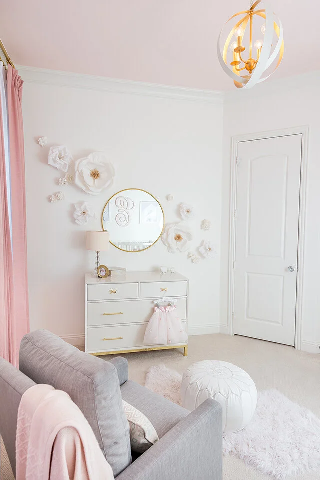
Blush adds a touch of femininity to this charming nursery.
Design by Leopard + Black Interiors
Photo by Phillip Yager

Soft pink hues adds a warm and comfortable vibe to this eat-in kitchen.
Design by Leopard + Black Interiors
Photo by Phillip Yager
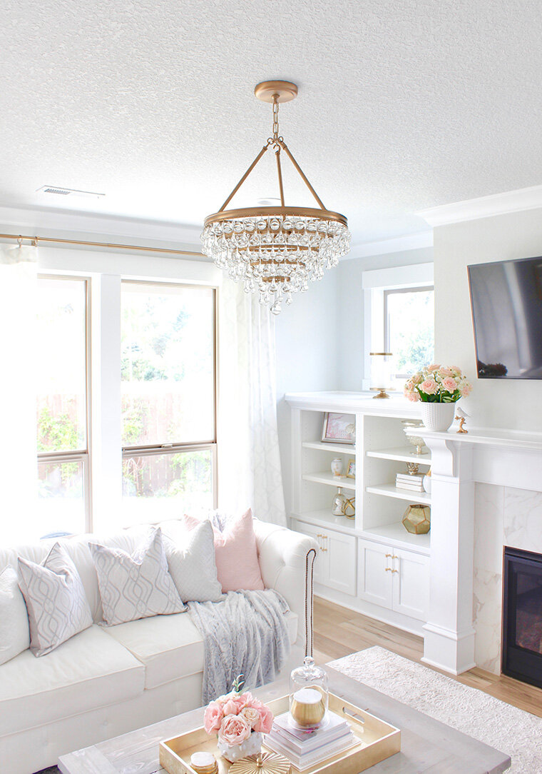
A sprinkle of blush tones accents this bright and sunny room with throw pillows and florals.
Design by Summer Adams

Patterned window coverings and throw pillows in soft pink adds a feminine touch to this living room.
Design by @janabekdesign

From bedding to wallpaper, every pink detail was coordinated in this blushing nursery.
Design by Shay Geyer

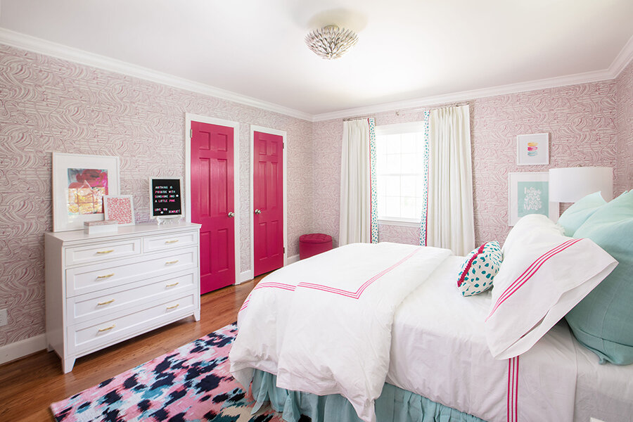
From blush to bold, shades of pink envelope this cheerful bedroom.
Design By Jana Donohoe Designs

As versatile as a neutral, pink makes for the perfect color pairing in any design.
Design By Jana Donohoe Designs

Tickled pink tones against crisp white, classic.
Design by @ashleycooperdesign
Photo by @catherinetrumanphoto
Showcase the beauty of blush in a variety of spaces in your home. This sweet and fresh shade can be paired with an array of colors and finishes. Enjoy all the inspiration that this rosy hue can bring to your space!
Use #CrystoramaStyle to show us your lighting design!


