A Modern Boho Sunroom Transformation
Meet Amanda Walker of Dwell Aware
Amanda is a DIY home designer and a proud mamma of two. She lives in Dallas, Texas, where she and her family have lived for five years. The house was an outdated 1980’s builder-grade home. They have been updating the house over the past few years, including this chic new sunroom that we had the opportunity to be a part of her design process.
Amanda participated as a Guest Participant to update her sunroom for the One Room Challenge. “My design style is somewhat eclectic with a mix of modern, minimalism, boho, and industrial vibes,” says Amanda.
Her Design Inspiration
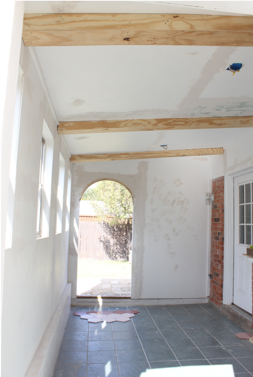
"The sunroom area seems to have been built onto our home 25 years ago. My husband and I both did not like the space, especially since the kitchen window looks directly into this room. It was very outdated with beige walls, old aluminum windows, fluorescent lighting, and unappealing tile. This space felt like it cut our backyard into two different sections and had no flow. Our first big DIY was building cedar sliding barn doors to allow the room to open on either side."
AMANDA’S DESIGN TIPS:
Don’t be afraid to make your home what you want it to be!
It’s easy to get caught up in making a home that isn’t your style, whether you are thinking about selling in the future or other people’s expectations.
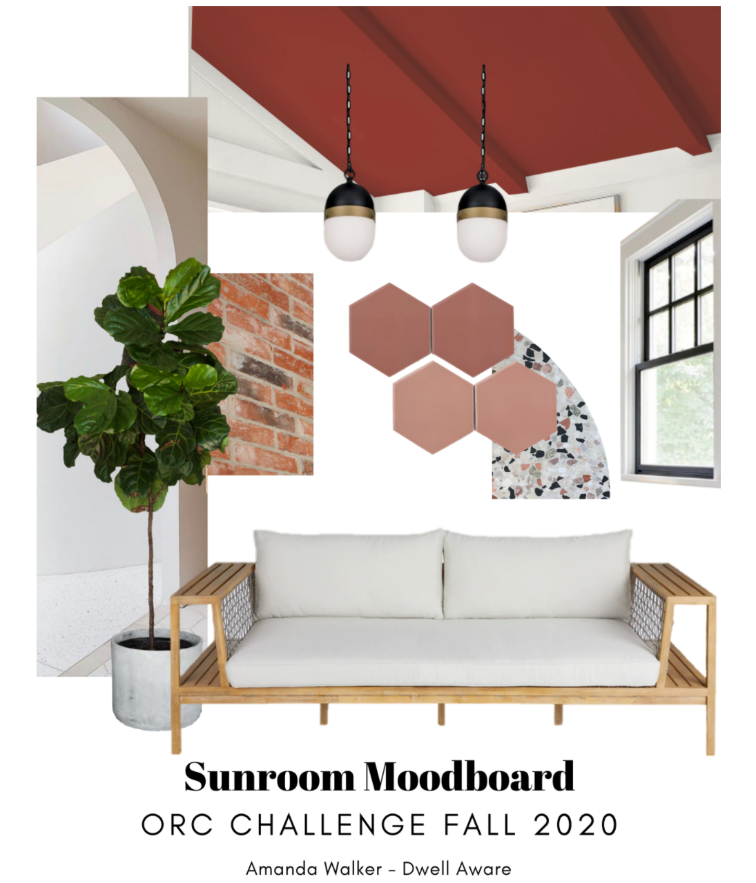
Start with inspiration from elements that are staying.
For example, in the sunroom I knew the exposed brick was staying, so I built the color palette and design inspiration around it.
Don’t pressure yourself to have it all together.
Building a home takes time. It can take a while to figure out a space and what you truly want for it. Don’t rush it! All good things take time.
Any fun or challenging behind-the-scenes stories?
This project was full of challenges, as it presented a lot of firsts. From DIY tiling to first time archway and faux beam building! I think the biggest challenge was being patient with the process of each project. It went so fast, yet felt slow with all the learning curves!
before
during
after
“The Capsule design is gorgeous. From the moment I laid eyes on these fixtures, I knew it was the perfect fit for the sunroom. I couldn’t believe they were outdoor lights! The curves, black and gold touches, and the scale for the room were just right!”
“The lighting from Crystorama helped bring the sunroom together design-wise! The Brian Patrick Flynn Capsule lighting curves played into the new archways while balancing the more masculine feel of the freshly cemented retainer wall.”


