Design Q & A with Mandi Gubler of Vintage Revivals
Designer and DIY’ER Mandi Gubler of Vintage Revivals is known for the way she uses color in her design projects. She loves mixing different styles, and nothing is off-limits if it has the right energy. She combines new with vintage pieces that have a story, and you can most likely find plants in just about every corner of her home.
Mandi took on her biggest design challenge when she and her husband bought a 1928 commercial property called the Santa Clara Merc located in a small town in Southern Utah.
The Merc, short for Mercantile, is one of the most historically significant buildings in Santa Clara. When the Mormon pioneers settled in Santa Clara, a few members started a co-op in a small room in one of their houses. The business grew, and in 1928 a modern store was built.
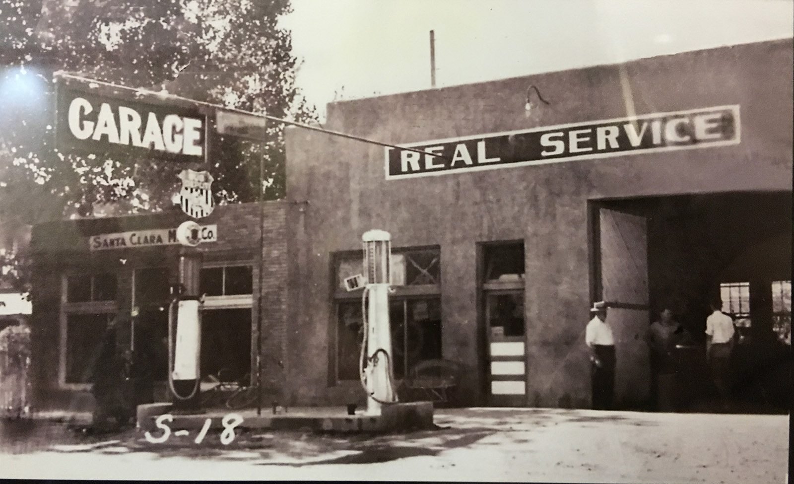
After some time, an adobe brick garage and gap pumps were added to the store. The Santa Clara Post Office also spent ten years at this location. The Merc became the center of bustling Santa Clara and the last stop to get gas and supplies on your way to Vegas/California.
The Merc belonged to the Hafen family for 124 years until 1986, when it to another family. The surrounding larger grocery stores became too much competition, and The Merc closed in 2000. Little was recorded on the history of the building until it was listed on the market in 2016.
The Merc in it’s early years.
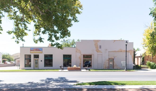
The Merc in 2016 when it was listed by real estate agent.
In 2016 Mandi and her husband started building a new construction home, but something did not feel right about the process, she explained. She got a call to visit a commercial property that had the potential to be a storefront, and when she walked into The Merc, she fell in love and knew this would be the home she meant to build.
Q. Were you familiar with The Merc and its rich history before you want to visit the space?
A. I wasn't super familiar with it. I knew that Santa Clara had a lot of tight-woven families and that the community was very protective of the historic main street.
Q. What made you go "this is my home" when you walked through the door?
A. I've always dreamed of doing a commercial conversion, but their aren't any cool warehouse-type buildings in small-town southern Utah. When I walked into the Merc, it had the most incredible energy and was a big blank canvas. As I walked through the space, I fell in love, especially with the part of the building we call Phase 2. It was originally a garage and made out of adobe. All the original windows had been boarded, but as soon as I saw it, I knew that it was supposed to be our house.
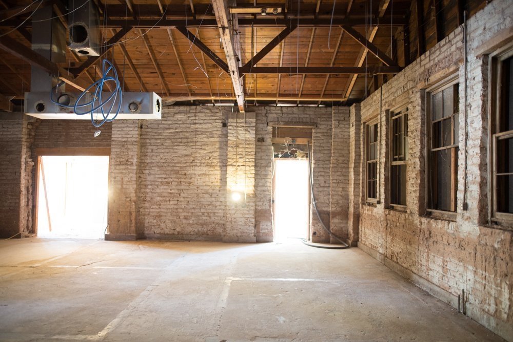
The Merc during Mandie initial walk through
Q. Your husband Court was not a fan at first. What changed his mind?
A. Court is the world's most supportive husband. He knew how excited I was about this project and, without ever really seeing the vision like I do, he went along with it.
Q. Did you fall into issues as you started the renovation process?
A. Everything from zoning and approving the use of the building to heavy environmental testing because of the previous uses became hurdles. Our plans always changed a little because of a wall unable to move or a crooked ceiling. There were many designing and changing things on the fly, which is the way I love to design.
Q. How long did it take you and Court to Renovate the building?
A. We found it in September of 2016 and bought it in March of 2017. We started renovations in July 2017 and renovated for 10 months before moving into half of the building. Phase 1 included the kitchen, bedrooms, laundry, bathrooms, and office. In October 2020, we started Phase 2 of the renovation, which is the living area, primary bedroom and bathroom, and loft office.
Phase 1 image of The Merc.
Q. Tell us about your design plan and how it evolved as you started renovating?
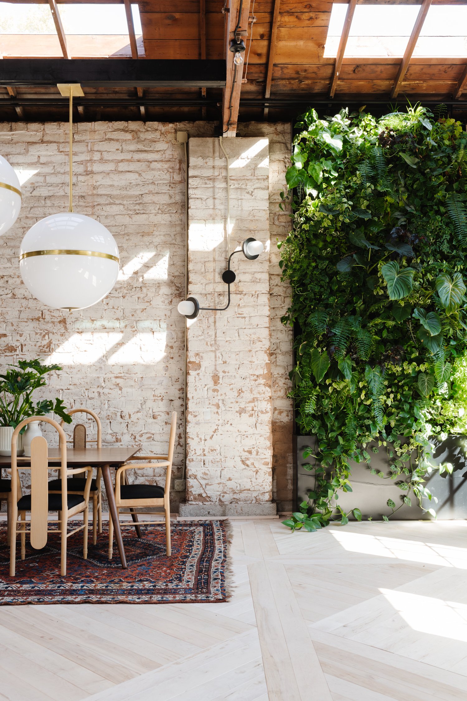
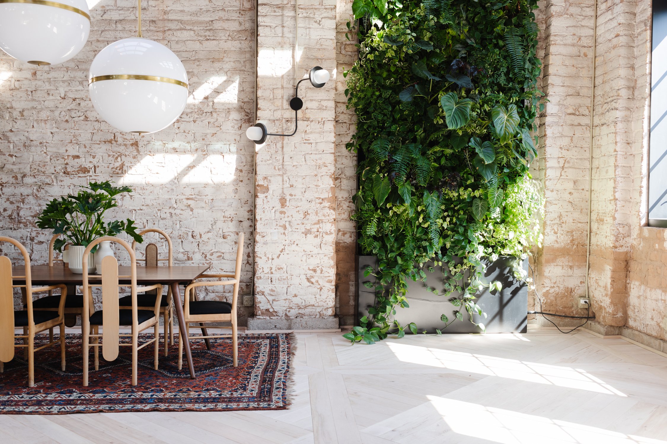
I don't design things based on specific plans, it's more about the feeling you get when you walk into the space. There were some things that I knew I wanted, like the bones of the building to feel still historical, and some general design ideas like floor to ceiling bookcases, but the design was (and is!) always evolving. The most important thing was that the design of the Merc celebrating life. Showing proof of lives that were here long before us and finishes that allow us to leave our mark on this beautiful building. Things like keeping the original roof, the authentic finishes on the adobe walls, using raw wood floors all show patina finishes of living.
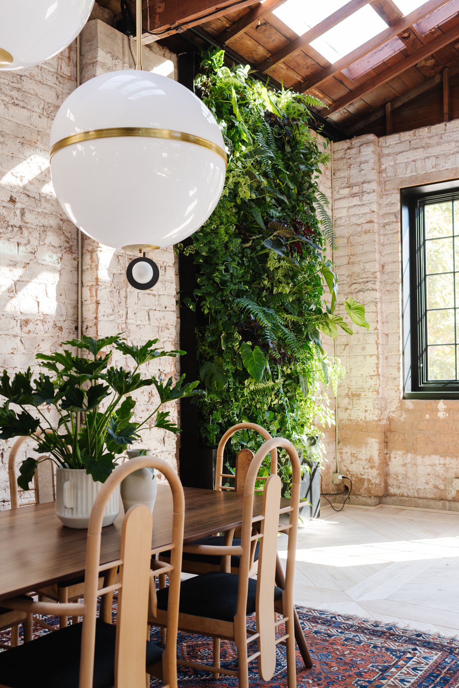
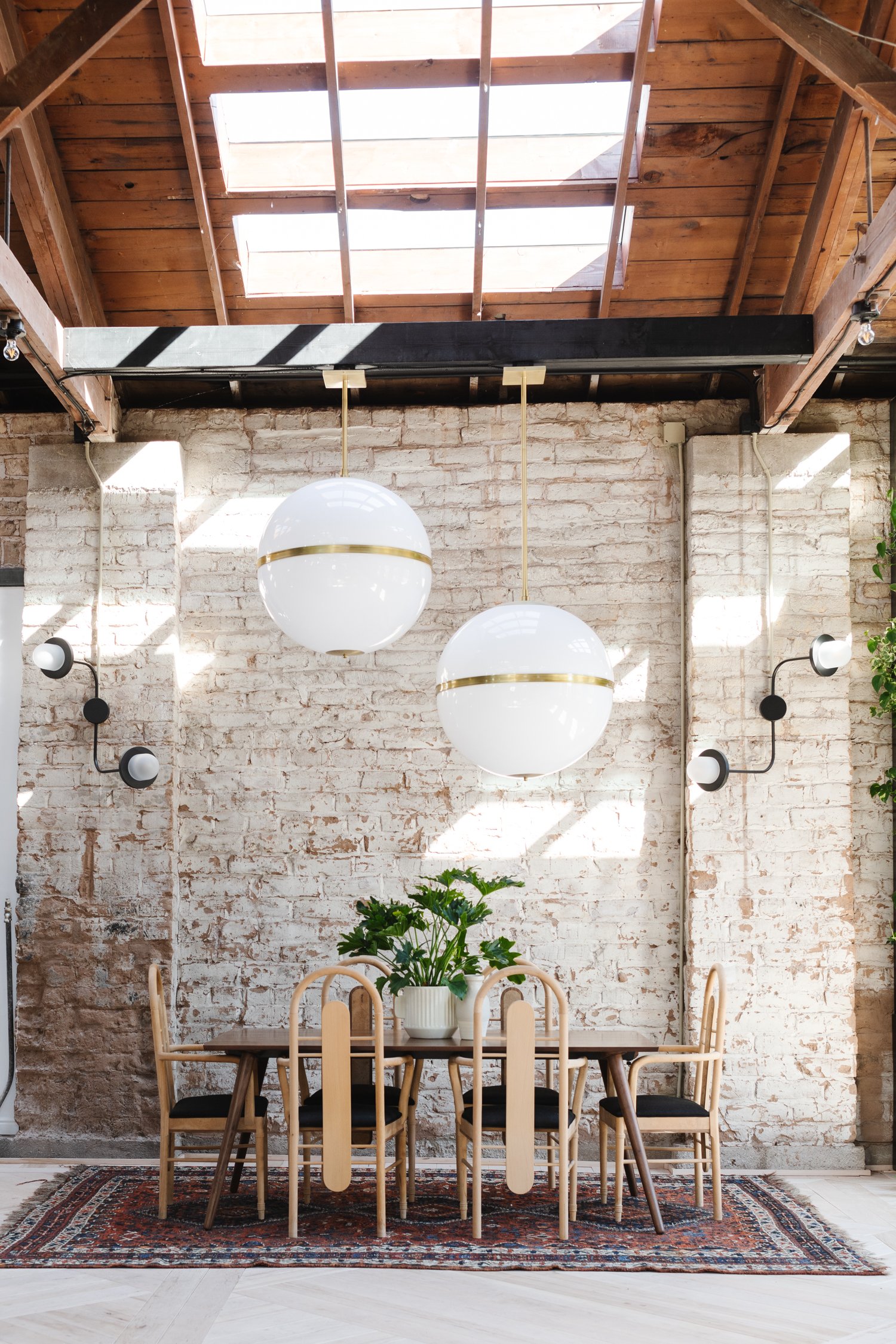
Q. You featured Brian Patrick Flynn Truax Collection for Crystrama in the dining room. What made you select these fixtures?
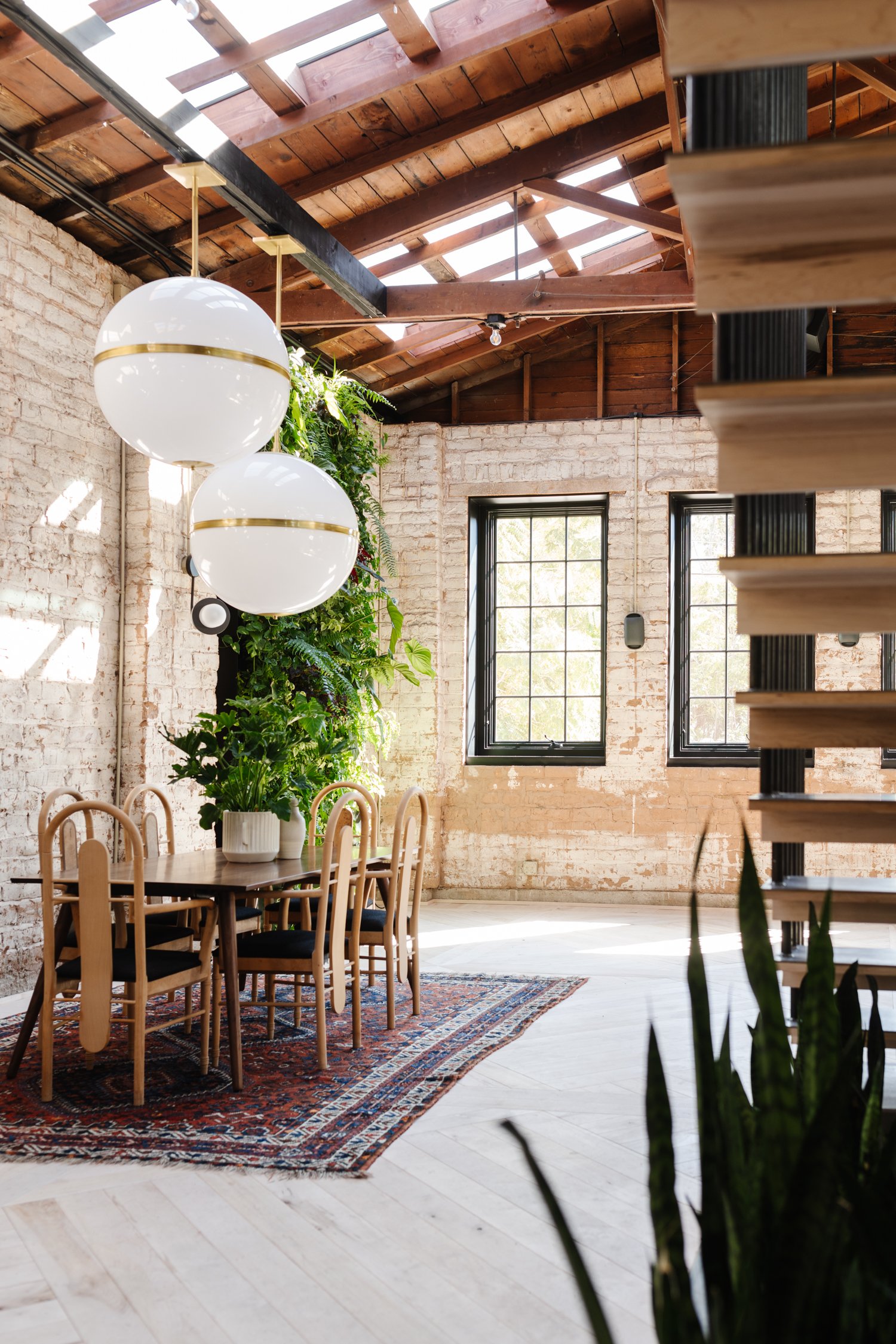
A. I loved the Brian Patrick Flynn Truax fixtures the moment I saw them! We kept the original wood roof on the building, and because it was so tall and open, I knew that I needed some statement light fixtures. The Truax fixtures were part of an evolving design hurdle. Initially, I planned to use 5 of them spread throughout the whole space. But once we had one installed, it just wasn't sitting right in my gut. So with some creative problem solving, we added a faux truss beam and installed 2 of them at different heights over the dining table. It was magical and exactly the feeling I wanted!
You can view the full transformation of The Merc here and follow Mandi on her Instagram handle @vintagerevivals as she converts her 1928 Mercantile shop into her dream home!
For more lighting and design inspiration, visit us on Instagram, Facebook, Pinterest, Youtube and Twitter and use #CrystoramaStyle to share your designs!


