A BRIGHT AND AIRY HOME OFFICE REFRESH
Jessica reached out to Crystorama for her first participation in the One Room challenge™ event. This event allowed her to stay motivated and to document the project from start to finish. “It was a great source of encouragement and inspiration to follow along on the design journeys of other amazing designers, says Jessica.
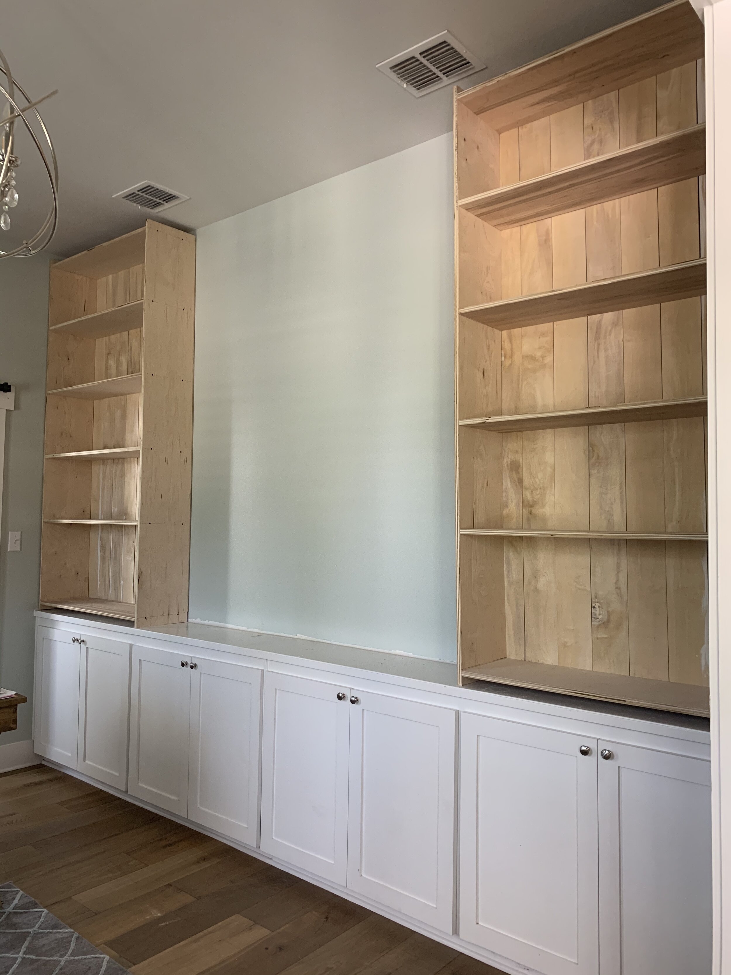
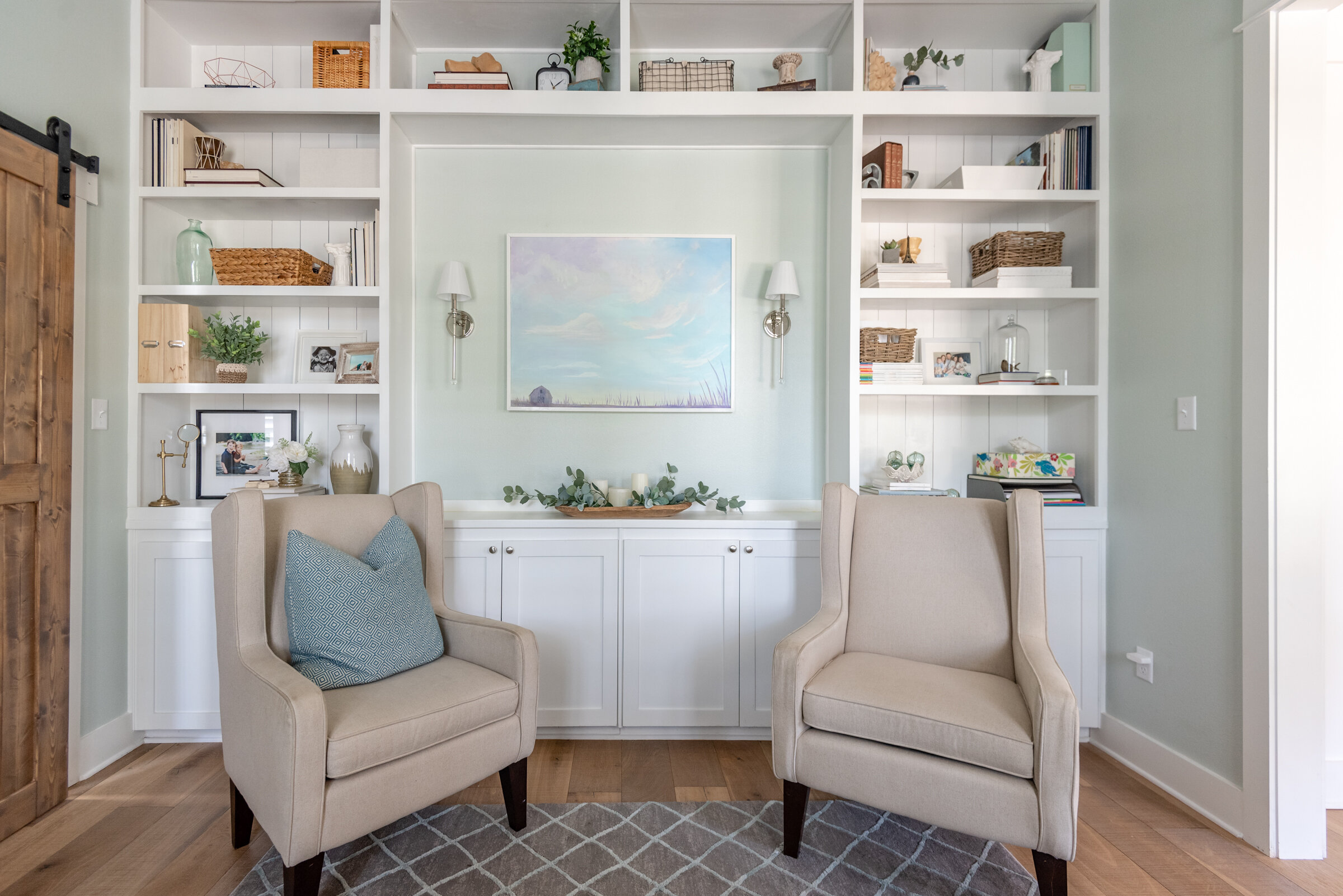
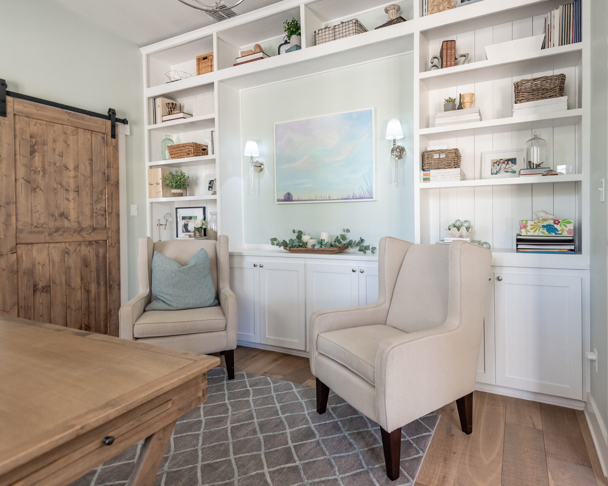
Jessica’s design style is a blend of farmhouse and coastal with a classic, timeless aesthetic. For her first ORC project, Jessica refreshed her home office and built a wall of bookshelves with a space in the middle for an art piece and a beautiful pair of sconces. “I wanted to showcase the beautiful books and items that inspire me and conceal items that I use, but are maybe not so aesthetically pleasing. While this is a functioning office space, I never want my kids to feel like this room is off-limits. I tried to design a space that feels cozy and inviting for all,” says Jessica.
MEET JESSICA
Jessica is a professional photographer and works on residential home design. She has a Masters's in architecture and has recently designied her own home that in a small Texas town. Most days, you can find her sharing her home, design tips, and DIY projects on her blog and Instagram handle @the.old.barn.
HER Design Inspiration
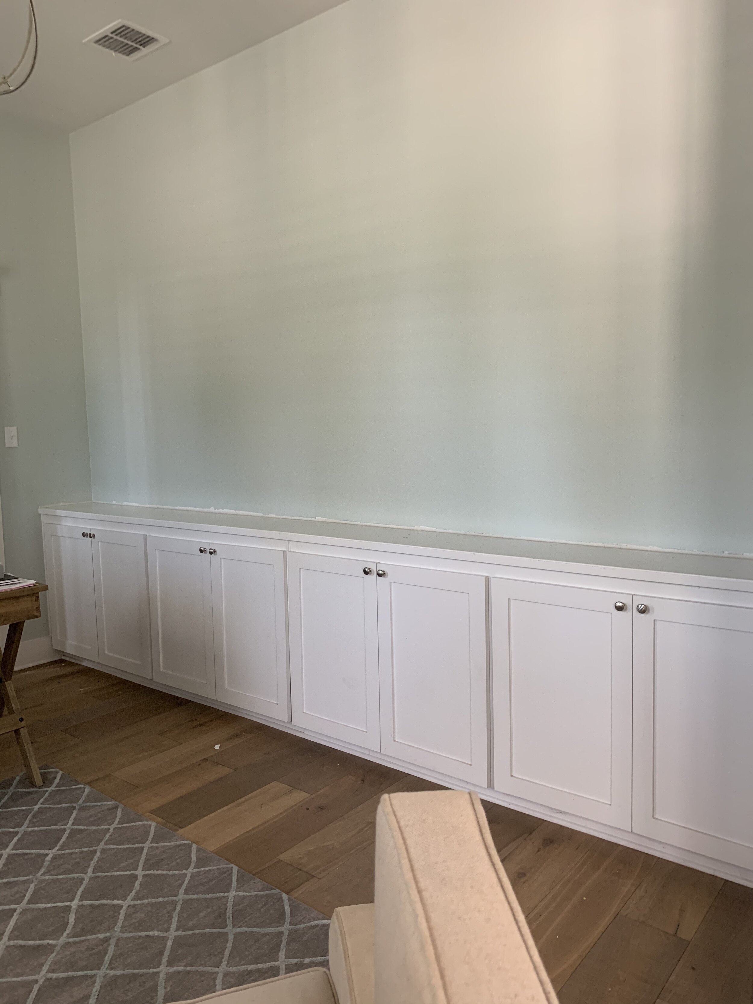
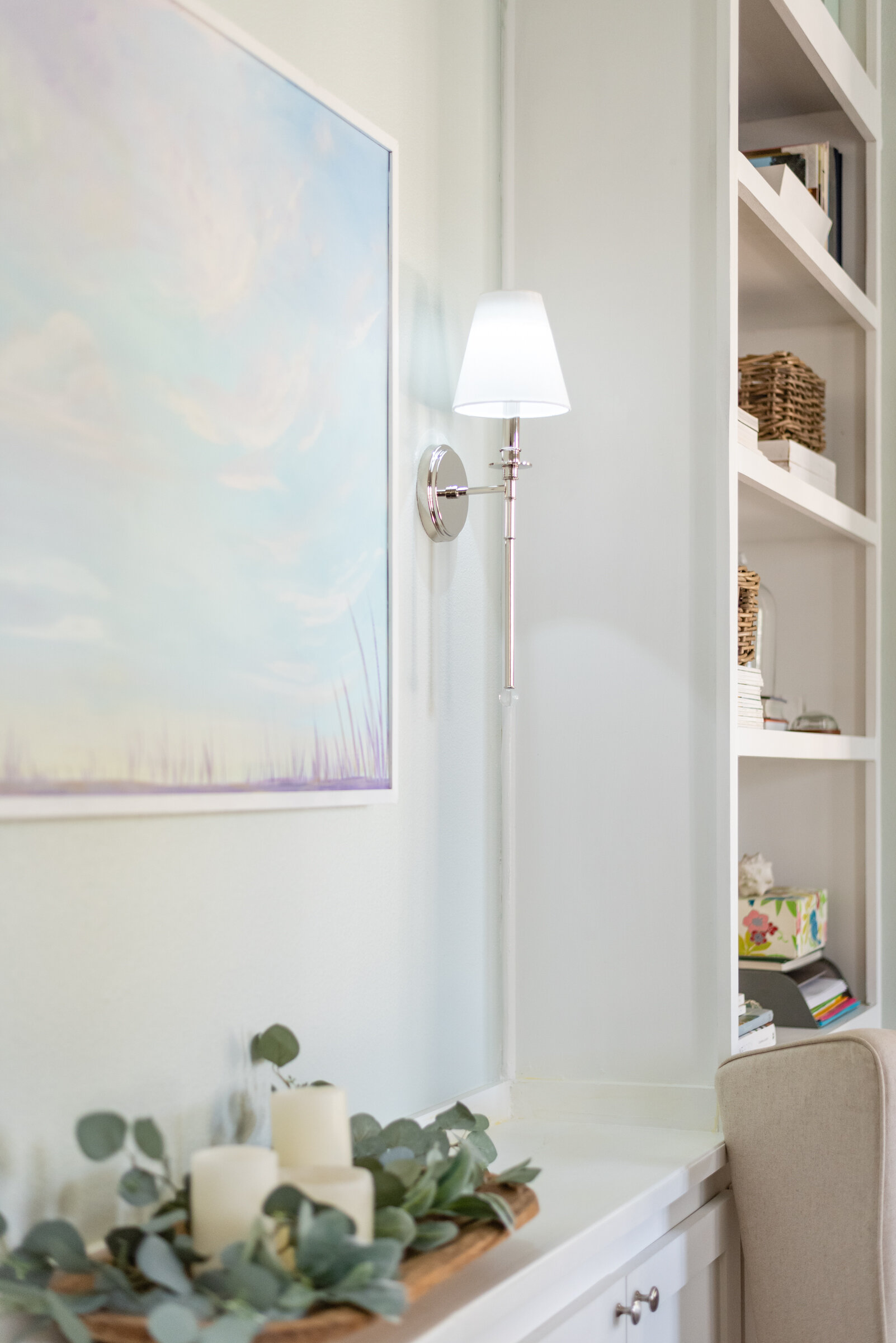
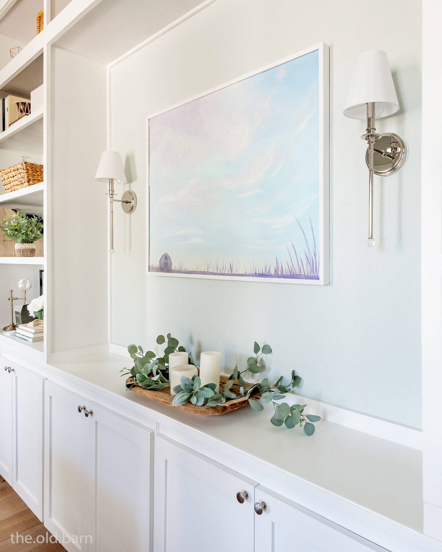
The most important part of this project is the focal wall with bookshelves. Jessica was working out of cardboard boxes, so storage and shelf space were crucial. Balance was key for Jessica; a full wall of shelves would overwhelm the space, so she opted to leave an open wall area for art and sconces. When she built, they had the lower cabinets built, and the wall color Sherwin Williams Sea Salt painted on the walls. “The sconces were just the extra touch this space needed to finish off the feature wall. They are like the perfect pair of earrings elevating a classic outfit, adding sparkle, balance, and brightness”, says Jessica.
Jessica’s tips on designing an office at home.
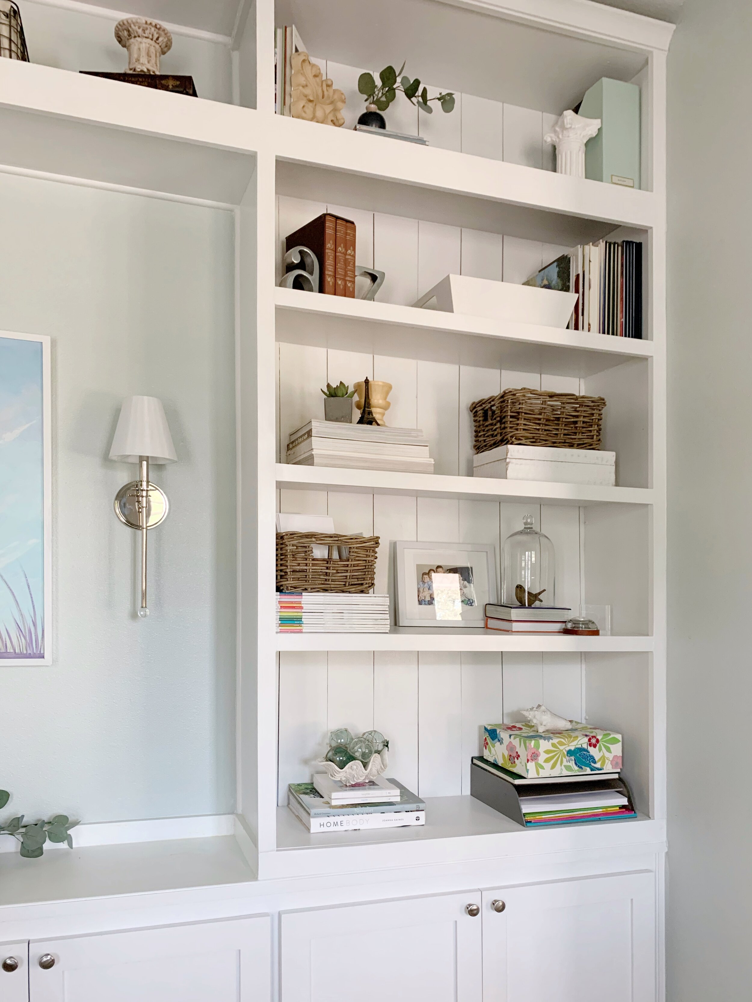
Evaluate the Space: Know what you need to store and how much space it requires, then add plenty of open space for decor and objects that inspire.
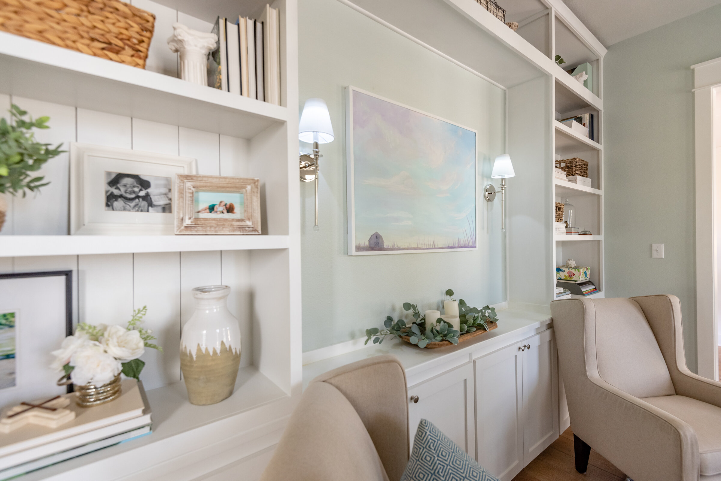
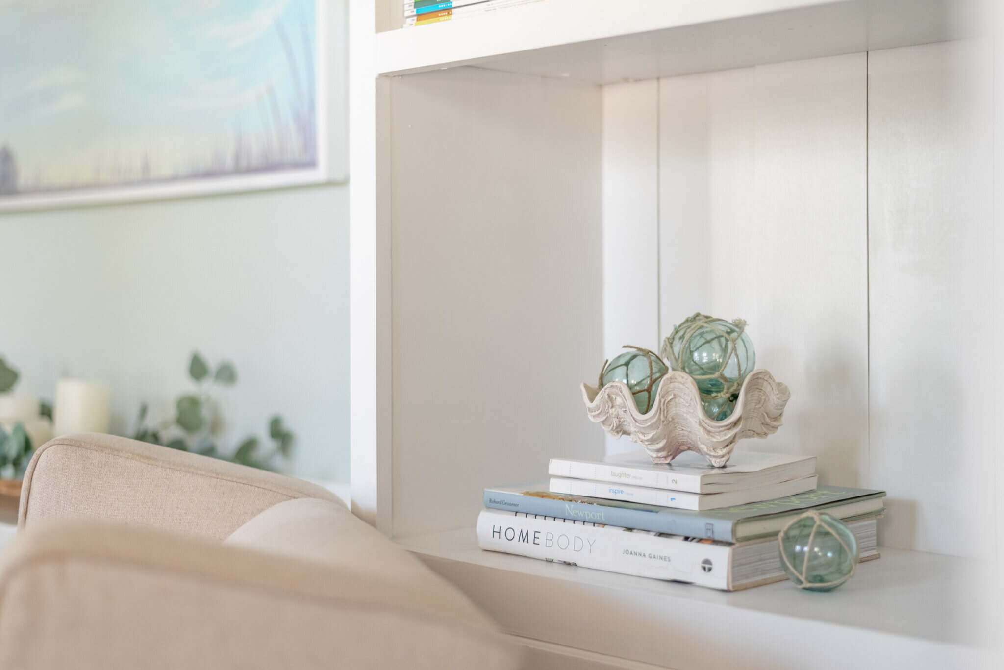
Smart Storage: Hide less than pretty items in baskets and file boxes. Paperbacks, office supplies, and other not-so-pretty stuff hide in the cabinets below. Standing some books while stacking others gives you a nice elevated perch for pretty little decor pieces. If the color of the spines isn't working aesthetically, you can flip your book's pages edge out, and sometimes removing the dust jacket helps.
A Clear Goal: Have a clear vision of the way you want to use the space on a daily basis. List all purposes for which the room will be used and make sure the end product has everything needed for those purposes.
Let there be Light: Office lighting is very important! I chose a pair of the Riverdale wall sconce to flank the art and to brighten up the recessed area. When choosing lighting, think of the task they will be used for. Does the space have any dark corners? Now choose fixtures that work with your style for the room. Sometimes the lighting can provide the inspiration piece for the whole room!
Balance: In this room, I balanced the pair of tall windows with a pair of tall bookshelves, balanced the mass of the bookshelves with the open space between, on the shelves heavy items are balanced with light items, open space with filled space.


